In Hour 17, "Menus in VB Applications," you learned how to add menus to your applications. Many applications use toolbars with buttons that mimic menu options. Toolbars are part of most major Windows applications, and they can be part of yours as well.
In addition, with toolbars you can draw your own graphics on the form. Although VB's graphic-drawing tools are fairly primitive, you can draw lines and circles and other basic shapes to accent and highlight areas of your form.
The highlights of this hour include
The tools that appear on your Toolbox window are called intrinsic controls. You can add additional controls to the toolbar. As a matter of fact, you can obtain controls from sources other than Microsoft because many people create controls for Visual Basic.
TIP: In Hour 21, "Visual Basic and ActiveX," you will learn more about how developers create new controls for Visual Basic. This book's CD-ROM comes with a complete control-building application called the Visual Basic Custom Control Edition.
Visual Basic's Professional and Enterprise Edition users can take advantage of
an extra control that comes with Visual Basic, called the Toolbar control. It comes
in a collection of other controls named the Microsoft Windows Common Controls 5.0.
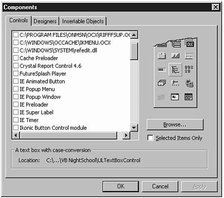
To add this set of controls to your toolbar, select Project | Components (Ctrl+T)
to display Figure 19.1's Components dialog box.
Figure
19.1. Adding more tools to the toolbox
with the Components dialog box.
Scroll the box down to the Microsoft Windows Common Controls 5.0 entry and select
it. Click OK. When you look at the Toolbox window once again, you'll see new controls
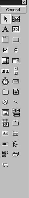
on the toolbox. Figure 19.2 labels these tools.
Figure
19.2. The Common Controls package of tools
gives you additional power.
NOTE: You'll probably recognize the purpose of most of these new tools. With these additional tools you can add a status bar to your form, you can display a progress bar during a long sort or calculation, and the Tab Strip control gives you the ability to display a multiple-page dialog box (called a properties sheet or a properties page).
New Term: A properties sheet or properties page is a dialog box that contains several tabbed pages. Entering property values in the dialog box is often easier than entering them one by one in the Properties window.
As you know, a toolbar is a row of buttons with icons on them. The Toolbar control has one slight limitation: It cannot keep track of each image that you place on a toolbar button. Instead, the Toolbar control only works with a special control called an Image List control. Fortunately, the Image List control appears on the toolbox when you add the Microsoft Windows Common Controls 5.0 control set, as you did in the previous section.
Therefore, you might want to practice adding a toolbar to a Form window by opening a new project and then placing an Image List control on the Form window. Expand the Form window slightly so that the Form window is wide enough for a toolbar (approximately 6,645 twips wide).
The Image List control does not look like much. Just like the Image control, the
Picture Box control, the Timer control, and the Common Dialog Box control, the Image
List control's placed size and location do not matter much because the user will
never directly see the Image List control on the form. The user will, instead, see
images that the Image List control keeps track of. The Image List control works a
lot like a graphic image array. The Image List control holds images from files, and
when you're using the Image List control for toolbars, the Image List control holds
toolbar icons such as the ones in VB's Graphics\Icons folder.
New Term: An image list is a list of images in an array-like control called
the Image List control. The easiest way to add images to the Image List control is
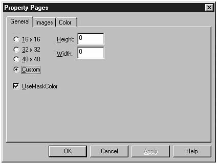
by clicking the Image List control's Custom property to display Figure 19.3's
custom property pages. This dialog box organizes the Image List control's figures
and lets you manage each figure's property separately.
Figure
19.3. Specifying Image List control properties
in the Property Pages dialog box.
NOTE: Although the first page of the Image List control's property pages lets you specify an image's size, you don't need to worry about the size if the graphics files are exactly the size you need to display, just as icon files (with the .ICO extension) are. If you use the Image List control to group graphic images of other kinds of files, you will need to specify each image's size if the file's size does not match the size you want to store the image as.
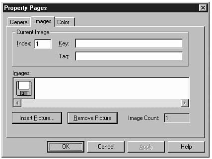
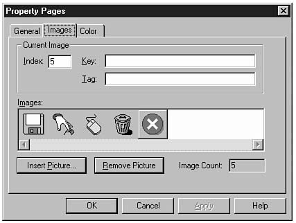
Click the Images tab to display the Images page. Here you will build a list of images that will ultimately end up on your application's toolbar. To add some images for this lesson's sample toolbar, perform these steps:
Figure
19.4. The Image List control now has one
image.
Keep inserting images in the following order (from the same folder to keep things
simple): Key04, Mouse02, Trash01, and W95mbx01.
As you insert the images one at a time, you'll notice that Visual Basic automatically
updates the image's Index text box value. After you add the final image, your image
list should look like Figure 19.5's list of icons.
Figure
19.5. The image list contains five icon
images.
TIP: If you want to change the toolbar's colors from the standard color scheme (typically a gray background just like Visual Basic's toolbars), click the Color tab and select a different color scheme.
Name the Image List control imlToolBar so the Toolbar control can reference the images you just stored in the list.
Double-click the Toolbar control to add a toolbar to the top of the form. The toolbar will first appear at the top of the form, which is where most toolbars reside. You can change the Align property if you want to place the toolbar against another edge of the form. Change the toolbar's Name property to tlbNew.
TIP: If you want to give your user a menu choice to place the toolbar elsewhere, the menu selection can change the Align property value so the toolbar moves to another location on the Form window.
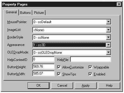
Click the toolbar's Custom property to display the toolbar's Property
Pages dialog box, which is shown in Figure 19.6. Although you can set most of the
dialog box's properties from the Properties window, you'll find that the Property
Pages dialog box makes setting up the toolbox simpler.
Figure
19.6. The Toolbar control's Property Pages
dialog box.
To connect the image list to the toolbar, open the ImageList drop-down list box and
select imlToolBar (if other image lists appeared on the form, they would
all appear and you could select the one that goes with the toolbar). Select the 1-ccFixedSingle
BorderStyle property to help distinguish the toolbar from the rest of the
form's controls.
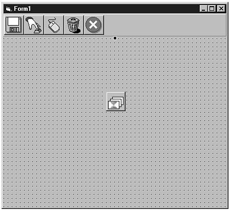
To add the toolbar button, click the Buttons tab to display the Buttons page. For each button, click the Insert Button command button and change the Image value to 1 (the first image's Index property value). Also type Save for the Key value. When you click Apply (to apply the property values), the first toolbar button will appear with the disk icon that first appears in the image list.
Continue clicking the Insert Button command button and updating the Image text box. Use the following values for the last five Key values: Save, Button, Mouse, Trash, and Stop. When you finish the toolbar buttons, close the dialog box, and the five toolbar buttons with their corresponding icons from the Image List control will appear, as shown in Figure 19.7.
NOTE: You will use the Key values inside code to determine exactly which toolbar button the user clicks.
TIP: Many programmers like to add the same Key values to the ToolTips property as well so the toolbar supports tooltip-based help.
Figure
19.7. The toolbar is now complete.
Run the application and try the new toolbar. When you click a button, you'll see
the button clicking. You've now got to hook up the commands to the buttons. Stop
the running application to add the event procedure.
The toolbar acts like a control array. To add code that responds to a toolbar's button click, double-click the Toolbar control to open a new event procedure. The first and last lines appear here:
Private Sub tlbNew_ButtonClick(ByVal Button As ComctlLib.Button)


End Sub
The ButtonClick() event is the toolbar's event that occurs when the user clicks a toolbar button. The argument tells your code which button the user clicked so you can respond accordingly. You must use the argument's Key method to determine the button clicked. The button's Key method returns the string you entered for the toolbar button's Key method. The following code shows an outline of the code you could write that would execute a different procedure depending on the user's toolbar button click:
Private Sub tlbNew_ButtonClick(ByVal Button As ComctlLib.Button)

   ` Respond to button clicks

   Dim msgPress As Integer

   ` Display a message box depending

   ` on which toolbar button the user clicks

   Select Case Button.Key

      Case Is = "Save":

         msgPress = MsgBox("You pressed Save", , "Save")

      Case Is = "Button":

         msgPress = MsgBox("You pressed Button", , "Button")

      Case Is = "Mouse":

         msgPress = MsgBox("You pressed Mouse", , "Mouse")

      Case Is = "Trash":

         msgPress = MsgBox("You pressed Trash", , "Trash")

      Case Is = "Stop":

         Unload Me

         End

   End Select

End Sub
Of course your application would do more than display a message box when the user clicks a toolbar button. More likely you would insert a Call statement to call a procedure that handles the toolbar button. If the toolbar's buttons mimic menu selections, as most users design toolbar buttons to do, the Call statement can call the corresponding menu item, such as Call mnuFileExit_Click.
NOTE: If you place the toolbar at the top of the form but the Form window contains a menu (or if you add the menu after you place the Toolbar control), the toolbar will appear beneath the menu and always give room for the menu. The menu's pull-down submenus will always appear on top of the toolbar.
The graphics you've worked with in this book have, until now, been graphic images stored in files. The Image and Picture Box controls display graphic images on the form. The Toolbar buttons can display icon images. You have yet to see how to draw your own graphics. The rest of this lesson introduces VB's drawing tools.
The Line and Shape controls work together to draw lines, boxes, and all kinds of circular figures on the form. By placing the controls and setting appropriate properties, you'll be adding flair to applications. The properties of each control that you place on your form determine exactly what kind of image the control becomes.
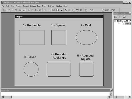
Here are the primary graphic images that you can draw with the Line and Shape controls:
Figure 19.8 shows each of these primary images. By combining these fundamental
geometric images and setting appropriate color and size properties, you can draw
virtually anything you need to draw on the form.
Figure
19.8. The images that you can draw.
You use the Line control for drawing lines of various widths, lengths, and patterns. The Shape control handles the drawing for all the other fundamental shapes.
The Line control contains properties that specify the width and length of lines you draw. In addition, you can change the pattern of each line you draw.
Table 19.1 lists the fundamental property values for the Line control. Table 19.2 contains the values that you can specify for the BorderStyle property. The BorderStyle property determines the pattern that Visual Basic uses to draw the line. By specifying various BorderStyle values, you can vary the line pattern. If you assign a BorderStyle property at runtime, you either can specify a number that represents BorderStyle or use one of Visual Basic's named literals.
Table 19.1. The Line control's fundamental properties.
| Property | Description |
| BorderColor | Sets the line's color. |
| BorderStyle | Contains one of seven values that specifies the pattern of the drawn line. See Table 19.2 for available BorderStyle values. The default value is 1-Solid. BorderStyle has no effect on lines with BorderWidth greater than 1 twip. |
| BorderWidth | Specifies the size, in twips, that the line takes. |
| DrawMode | An advanced style that determines how the bit patterns of the line interact with the surrounding form's bit appearance. The default value, 13-Copy Pen, works well for virtually all Visual Basic applications. |
| Visible | Holds True or False, indicating whether the user can see the line control. You may want to set the Visible property in code so the line appears as a highlighting tool. |
| X1 | Contains the number of twips from the left of the Form window to the start of the line. |
| X2 | Contains the number of twips from the left of the Form window to the end of the line. |
| Y1 | Contains the number of twips from the top of the Form window to the left starting point of the line. |
| Y2 | Contains the number of twips from the top of the Form window to the lower ending point of the line. |
| Value | Named Literal | Description |
| 0-Transparent | vbTransparent | Background comes through the line. |
| 1-Solid | vbBSSolid | The line is a solid line. |
| 2-Dash | vbBSDash | The line is composed of dashes. |
| 3-Dot | vbBSDot | The line is composed of dots. |
| 4-Dash-Dot | vbBSDashDot | The line is composed of a continuing dash-dot-dash-dot. |
| 5-Dash-Dot-Dot | vbBSDashDotDot | The line is composed of a series of one dash followed by two dots. |
| 6-Inside Solid | vbBSInsideSolid | Same as 1-Solid for lines. |
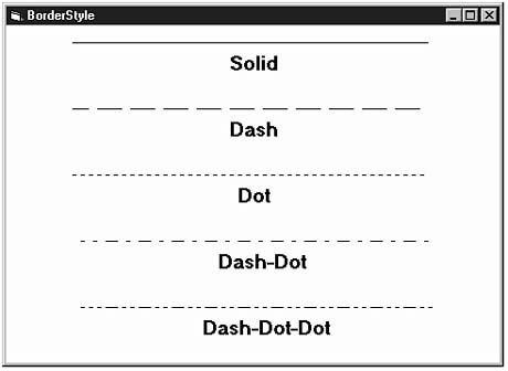
Figure 19.9 shows how various BorderStyle settings affect the lines you
draw. BorderStyle determines how a series of dashes and dots compose the
line's pattern. (Is this Morse code we're speaking here?)
Figure
19.9. The Borderstyle property values.
To draw a line, double-click the Line control on the toolbox. A line appears in the
center of the form with two handles on each end. To move the line to a different
location, drag the center of the line with the mouse. To lengthen or shorten the
line, drag either handle on the line. You can raise and lower either end of the line
by dragging either end's handle with the mouse.
After you position the line with the mouse in the approximate location at which you need the line to appear, you can fine-tune the line's size and location by setting the various property values. If you're a patient programmer, you can even animate the lines by changing the X1, X2, Y1, and Y2 property settings repeatedly through code.
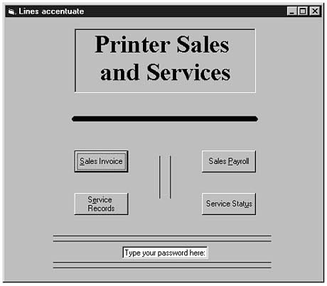
Figure 19.10 contains the Form window that might be used as a company's front-end
form. The various lines help separate controls from the title. As you can see, lines
help focus the user's attention.
Figure
19.10. Accenting forms with lines.
The Shape control gives you the ability to draw six different kinds of figures on the form. The various shading and color properties help you distinguish one shape from another. Table 19.3 contains the basic properties you'll use for the Shape control. The most important property is the Shape property. The Shape property gives a shape one of the six fundamental shapes.
Table 19.3. The Shape control's fundamental properties.
| Property | Description |
| BackColor | Specifies a Windows color value that determines the background color of the shape. |
| BackStyle | Contains either 0-Transparent (the default) or 1-Opaque, which determines whether the background of the form appears through the shape or if the shape hides whatever it covers. |
| BorderColor | Specifies a Windows color value that determines the color of the shape's bordering edges. |
| BorderStyle | Contains one of seven values that specifies the pattern of the shape's border. Table 19.2's Line control's BorderStyle values provide the shape's BorderStyle possible values as well. The default value is 1-Solid. BorderStyle has no effect on shapes with a BorderWidth greater than 1 twip. |
| BorderWidth | Specifies the size, in twips, that the shape's outline takes. |
| DrawMode | An advanced style that determines how the bit patterns of the shape interact with the surrounding form's bit appearance. The default value, 13-Copy Pen, works well for virtually all Visual Basic applications. |
| FillColor | Specifies a Windows color value that determines the color of the shape's interior lines. |
| FillStyle | Contains one of eight values that specifies the pattern of lines with which Visual Basic paints the interior of the shape. Table 19.4 contains the possible values for the shape's FillStyle. The default FillStyle value is 0-Solid. |
| Height | Specifies the number of twips high that the shape is (from the highest point to the lowest point in the shape). |
| Left | Specifies the number of twips from the form's left edge to the shape's leftmost edge. |
| Shape | Contains one of six values that specifies the type of shape that the Shape control takes on. Table 19.5 contains the possible values for the shape's Shape property. The default Shape property is 0-Rectangle. |
| Top | Specifies the number of twips from the form's top edge to the shape's highest edge. |
| Width | Specifies the number of twips wide that the shape takes (at the widest axis). |
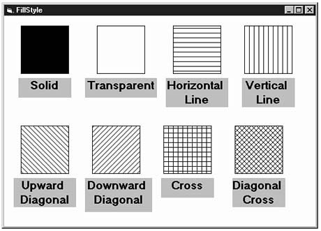
Table 19.4 contains the possible values for the Shape control's FillStyle property. Figure 19.11 shows you the various fill patterns that a shape can contain.
Table 19.4. The Shape control's FillStyle values.
| Value | Named Literal | Description |
| 0-Solid | vbFSSolid | Solid color fill with no pattern. |
| 1-Transparent | vbFSTransparent | The shape appears as an outline only. |
| 2-Horizontal Line | vbHorizontalLine | Horizontal lines fill the shape. |
| 3-Vertical Line | vbVerticalLine | Vertical lines fill the shape. |
| 4-Upward Diagonal | vbUpwardDiagonal | Upward diagonal lines fill the shape. |
| 5-Downward Diagonal | vbDownwardDiagonal | Downward diagonal lines fill the shape. |
| 6-Cross | vbCross | Crosshairs fill the shape. |
| 7-Diagonal Cross | vbDiagonalCross | Diagonal crosshairs fill the shape. |
Figure
19.11. The FillStyle property
determines the shape's interior design.
Table 19.5 contains the possible values for the Shape control's Shape property.
Figure 19.8 shows you the various shapes that the Shape control can take. Therefore,
when you want to place a square on a form, you'll place the Shape control on the
form and set the Shape property to 1-Square.
Table 19.5. The Shape control's Shape values.
| Value | Description |
| 0-Rectangle | A rectangle |
| 1-Square | A square |
| 2-Oval | An oval |
| 3-Circle | A circle |
| 4-Rounded Rectangle | A rectangle with rounded corners |
| 5-Rounded Square | A square with rounded corners |
In this lesson you have learned how to place toolbars on your application's form and to respond to the toolbar's event procedure. Unfortunately, there is not enough room to hold every Toolbox control, so if you want to use a non-intrinsic control, you must add that control from the Project | Components dialog box. Before you can add a toolbar, you must generate the image list that holds each of the toolbar's images.
The Line and Shape controls are the primary drawing controls. There are seven fundamental geometric shapes that you can draw. By specifying various properties, you can control how those shapes appear on the form.
The next hour's lesson does not discuss any new control, command, method, property, or event! The next lesson takes you on a tour of Visual Basic's debugging tools that help you test and eliminate bugs from your applications.
The quiz questions and exercises are provided for your further understanding. See Appendix C, "Answers," for answers.